Difference between revisions of "Add Item Attributes to the Design Pane"
From IMSMA Wiki
(Created page with "After you have specified the page setup for the field report template, you can begin adding item attributes. To add individual item attributes to the field report: <ol> <li>...") |
|||
| (33 intermediate revisions by 4 users not shown) | |||
| Line 1: | Line 1: | ||
| − | After you have specified the page setup for the | + | After you have specified the page setup for the data entry form template, you can begin adding item attributes/fields. |
| − | To add | + | To add attributes to the data entry form in the Data Entry Form Template Designer window: |
<ol> | <ol> | ||
| − | <li>Expand the item folder that contains the attribute by double-clicking the folder name in the | + | <li>Expand the item folder that contains the attribute by double-clicking the folder name in the Elements pane.</li> |
<li>Expand the data category that contains the item attribute.</li> | <li>Expand the data category that contains the item attribute.</li> | ||
| − | <li>Click the name of the attribute you would like to add to the | + | <li>Click the name of the attribute you would like to add to the data entry form.</li> |
<li>While holding down the left mouse button, drag the attribute to the form design pane.</li> | <li>While holding down the left mouse button, drag the attribute to the form design pane.</li> | ||
| − | <li>When the item | + | <li>When the item attribute is in the desired position, release the mouse button.</li> |
</ol> | </ol> | ||
| − | {{ | + | {{Note|If you drag an item attribute to the design pane which has previously been added, the following message displays: |
| − | :At least one of the | + | :At least one of the fields you dragged on to the template already exists in the template. You cannot add the same field more than once to the template. |
| − | Click the ''' | + | Click the '''OK''' button. |
}} | }} | ||
<ol> | <ol> | ||
| − | + | The element and its label are placed in the form design pane. | |
</ol> | </ol> | ||
| − | {{note|You can also add all item attributes to the | + | {{note|You can also add all item attributes in a category to the data entry form by dragging it to the design pane. |
}} | }} | ||
<ol start="6"> | <ol start="6"> | ||
| − | <li>Repeat the above steps to add additional item attributes to the | + | <li>Repeat the above steps to add additional item attributes to the data entry form.</li> |
</ol> | </ol> | ||
| − | When item attributes are dragged to the design pane, they | + | {{Warning | When item attributes are dragged to the design pane, they will use widgets for that data type. '''All''' parts of the widget should be present in the template in order to ensure that the widget will work for data entry. Although you can change properties and e.g. the label text. In the geographical widget you may delete the polyline/polygon table.}} |
| − | [[Image: | + | Depending on which data type the item attribute is and on the settings in the Data Inventory Manager the control / widget is different. |
| + | {| class="wikitable" | ||
| + | ! Type in DIM | ||
| + | ! Setting in DIM | ||
| + | ! Example | ||
| + | ! Widget | ||
| + | ! Control / widget | ||
| + | |- | ||
| + | | System | ||
| + | | No | ||
| + | | Land ID | ||
| + | | Local ID Generator | ||
| + | | [[Image:Local_ID_Gen.png]] | ||
| + | |- | ||
| + | | Country Structure | ||
| + | | No | ||
| + | | Victim Living In | ||
| + | | Country Structure | ||
| + | | [[Image:cs.png]] | ||
| + | |- | ||
| + | | Date | ||
| + | | No | ||
| + | | Status changed date | ||
| + | | Date | ||
| + | | [[Image:date.png]] | ||
| + | |- | ||
| + | | Geographical information | ||
| + | | No | ||
| + | | All items | ||
| + | | Geo data | ||
| + | | [[Image:geo.png]] | ||
| + | The difference between the columns ''X / Lon & Y / Lat'' and ''X / Longitude & Y / Latitude'' is described [[Summary Window#Data area - Geospatial tab|'''here''']]. | ||
| + | |- | ||
| + | | Multiple Select | ||
| + | | No | ||
| + | | Vulnerable group | ||
| + | | Multiple Select | ||
| + | | [[Image:multiselect.png]] | ||
| + | |- | ||
| + | | Number | ||
| + | | No | ||
| + | | Size of Living Space | ||
| + | | Text Field | ||
| + | | [[Image:number.png]] | ||
| + | |- | ||
| + | | Organisation | ||
| + | | No | ||
| + | | Organisation | ||
| + | | Organisation | ||
| + | | [[Image:org.png]] | ||
| + | |- | ||
| + | | Place | ||
| + | | No | ||
| + | | Status changed date | ||
| + | | Place | ||
| + | | [[Image:place.png]] | ||
| − | + | |- | |
| + | | Single Select | ||
| + | | Yes | ||
| + | | Land Status | ||
| + | | Radio button | ||
| + | | [[Image:rb_std.png]] | ||
| + | |- | ||
| + | | Single Select | ||
| + | | Yes | ||
| + | | Status changed reason | ||
| + | | Combo box | ||
| + | | [[Image:combobox.png]] | ||
| + | |- | ||
| + | | String / Text | ||
| + | | Only for CDFs | ||
| + | | Land Name | ||
| + | | Text Field | ||
| + | | [[Image:Textbox.png]] | ||
| + | |- | ||
| + | | String / Text | ||
| + | | Only for CDFs | ||
| + | | Major Impacts | ||
| + | | Text Area | ||
| + | | [[Image:Textarea.png]] | ||
| + | |- | ||
| + | | Subobject | ||
| + | | No | ||
| + | | Ordnance | ||
| + | | Table | ||
| + | | [[Image:Table.png]] | ||
| + | |- | ||
| + | | Time | ||
| + | | No | ||
| + | | Time to hospital | ||
| + | | Time | ||
| + | | [[Image:Time widget.png]] | ||
| + | |} | ||
| − | + | {{New_6.0 | It is possible to specify in the Data Inventory Manager if the text CDFs should be a Text Field or a Text Area in the template. It is not possible to switch between the two widgets in the Data Entry Form Template Designer. }} | |
| − | |||
| − | |||
| − | |||
| − | As you add and | + | As you add and delete item attributes to the form design pane, the Logical Tree pane is updated. |
| + | |||
| + | There are other types of elements than item attribute that may be added to the template. These are found in the Tool folder: | ||
| + | * [[Add an Image to the Data Entry Form Template | Icon]] e.g. logotypes | ||
| + | * [[Add a Line to the Data Entry Form Template | Line ]] e.g. as header and footer divider | ||
| + | * [[Add Text to the Data Entry Form Template | Text ]] e.g. template version number | ||
| + | |||
| + | {{NavBox HowTo Data Entry Forms}} | ||
| + | |||
| + | [[Category:NAA]] | ||
Latest revision as of 20:15, 19 June 2017
After you have specified the page setup for the data entry form template, you can begin adding item attributes/fields. To add attributes to the data entry form in the Data Entry Form Template Designer window:
- Expand the item folder that contains the attribute by double-clicking the folder name in the Elements pane.
- Expand the data category that contains the item attribute.
- Click the name of the attribute you would like to add to the data entry form.
- While holding down the left mouse button, drag the attribute to the form design pane.
- When the item attribute is in the desired position, release the mouse button.
-
The element and its label are placed in the form design pane.
| |
You can also add all item attributes in a category to the data entry form by dragging it to the design pane. |
- Repeat the above steps to add additional item attributes to the data entry form.
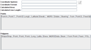
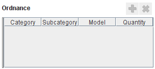
Depending on which data type the item attribute is and on the settings in the Data Inventory Manager the control / widget is different.
| Type in DIM | Setting in DIM | Example | Widget | Control / widget |
|---|---|---|---|---|
| System | No | Land ID | Local ID Generator | |
| Country Structure | No | Victim Living In | Country Structure | 
|
| Date | No | Status changed date | Date | 
|
| Geographical information | No | All items | Geo data | 
The difference between the columns X / Lon & Y / Lat and X / Longitude & Y / Latitude is described here. |
| Multiple Select | No | Vulnerable group | Multiple Select | 
|
| Number | No | Size of Living Space | Text Field | |
| Organisation | No | Organisation | Organisation | 
|
| Place | No | Status changed date | Place | |
| Single Select | Yes | Land Status | Radio button | |
| Single Select | Yes | Status changed reason | Combo box | |
| String / Text | Only for CDFs | Land Name | Text Field | |
| String / Text | Only for CDFs | Major Impacts | Text Area | 
|
| Subobject | No | Ordnance | Table | 
|
| Time | No | Time to hospital | Time | 
|
As you add and delete item attributes to the form design pane, the Logical Tree pane is updated.
There are other types of elements than item attribute that may be added to the template. These are found in the Tool folder:
| |||||||||||||||||||||||||