Difference between revisions of "Set Required Fields"
From IMSMA Wiki
m (Dionysia moved page Add Required Fields on the Design Pane to Set Required Fields without leaving a redirect) |
|||
| (3 intermediate revisions by the same user not shown) | |||
| Line 1: | Line 1: | ||
Most fields in a data entry form are optional by default, meaning that data enterers can leave them blank and still submit the data entry form for approval. The Data Entry Form Template Designer lets you set certain fields as required. Most types of fields, including options lists, text fields, and custom defined fields (CDF), can be set as required. Some elements, such as tables and fields with graphical buttons, cannot be required. | Most fields in a data entry form are optional by default, meaning that data enterers can leave them blank and still submit the data entry form for approval. The Data Entry Form Template Designer lets you set certain fields as required. Most types of fields, including options lists, text fields, and custom defined fields (CDF), can be set as required. Some elements, such as tables and fields with graphical buttons, cannot be required. | ||
| − | |||
<ol> | <ol> | ||
<li>In the form designer pane, select the element and click the '''Properties''' button.</li> | <li>In the form designer pane, select the element and click the '''Properties''' button.</li> | ||
| − | : | + | : If the element can be set as required, the ''Required'' check box is available. |
| − | |||
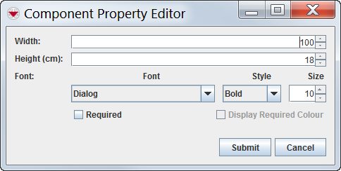
[[Image:ComponentPropertyEditor.png|center|Component Property Editor window]] | [[Image:ComponentPropertyEditor.png|center|Component Property Editor window]] | ||
| − | |||
<li>From the Component Property Editor window, select the ''Required'' option.</li> | <li>From the Component Property Editor window, select the ''Required'' option.</li> | ||
| − | |||
| − | {{ | + | {{Note|If you select ''Display Required Colour'', it will be visual during data entry that the field is required. |
| + | When there is only one option left in the template for a single-select field then it is '''highly''' recommended to make it '''both''' required and [[Set a Default Value | '''default''']].}} | ||
| − | + | <li>Click '''Submit'''. | |
| − | <li> | ||
| − | |||
| − | |||
</ol> | </ol> | ||
{{NavBox HowTo Data Entry Forms}} | {{NavBox HowTo Data Entry Forms}} | ||
| − | [[Category: | + | [[Category:NAA]] |
Latest revision as of 14:52, 4 December 2018
Most fields in a data entry form are optional by default, meaning that data enterers can leave them blank and still submit the data entry form for approval. The Data Entry Form Template Designer lets you set certain fields as required. Most types of fields, including options lists, text fields, and custom defined fields (CDF), can be set as required. Some elements, such as tables and fields with graphical buttons, cannot be required.
- In the form designer pane, select the element and click the Properties button.
- If the element can be set as required, the Required check box is available.
- From the Component Property Editor window, select the Required option.
- Click Submit.
| |
If you select Display Required Colour, it will be visual during data entry that the field is required.
When there is only one option left in the template for a single-select field then it is highly recommended to make it both required and default. |
| |||||||||||||||||||||||||
