Creating Dashboards in MINT: Difference between revisions
No edit summary |
No edit summary |
||
| (7 intermediate revisions by 2 users not shown) | |||
| Line 1: | Line 1: | ||
{{TOC right}} | {{TOC right}} | ||
== What is a dashboard? ==__NOEDITSECTION__ | == What is a dashboard? ==__NOEDITSECTION__ | ||
A (digital) dashboard is a '''visual display''' for specific '''key information'''. It should fit on a '''single screen''' and is used to monitor key information '''at a glance'''. There are a lot of good practices for dashboard design that help creating a targeted, clear and informative dashboard that is easy to understand for the end user. Please get in touch with your [[Information Management Team|GICHD IM advisor]] for more information and background material. <br /> | |||
More technically and specifically in MINT, a dashboard is a display arrangement of several [[Creating Ad Hoc Views in MINT|ad-hoc views]] and/or [[Creating Reports in MINT|reports]] and/or external content such as text or web pages. A dashboard can be '''interactive''', i.e. the user can have some control over the display via filters/input controls. | |||
== Create a new dashboard ==__NOEDITSECTION__ | == Create a new dashboard ==__NOEDITSECTION__ | ||
| Line 39: | Line 39: | ||
These filters can now be used as dashboard controls. If the two filters (''Province'' and ''Date of accident is after'') are dragged and dropped on the main dashboard pane, the result looks as follows: | These filters can now be used as dashboard controls. If the two filters (''Province'' and ''Date of accident is after'') are dragged and dropped on the main dashboard pane, the result looks as follows: | ||
[[File:dashboard_filter.png|center]] | [[File:dashboard_filter.png|center]] | ||
Then, by clicking on the filter icon in the top menu of the dashboard designer ([[File:filter_icon.png]]), the filters can further be refined with the ''' | Then, by clicking on the filter/parameter mapping icon in the top menu of the dashboard designer ([[File:filter_icon.png]]), the filters can further be refined with the '''Parameter mapping dialog'''. In this window, it can be specified exactly which filter should be applied to which element (dashlet), via which attribute. Of course, the attribute must be defined on the underlying element (ad-hoc view). The following example shows the configuration for the scenario mentioned above: | ||
[[File:filter_manager.png|center]] | [[File:filter_manager.png|center]] | ||
Then, once the dashboard is saved and executed, the filters can be applied as input controls, and the content of the affected elements will be refreshed accordingly. | Then, once the dashboard is saved and executed, the filters can be applied as input controls, and the content of the affected elements will be refreshed accordingly. | ||
==== Menus and options ====__NOEDITSECTION__ | ==== Menus and options ====__NOEDITSECTION__ | ||
At the top of the main dashboard pane the following buttons are available: | |||
[[File:MINT_dashboard_menu_options.png|center]] | |||
* Eye icon: allows to switch between designer and preview mode (to get an idea of how the dashboard will look like for the end user, and how the filters work). | |||
* Save/Save As icon: allows to save a dashboard. | |||
* Arrow to the left: allows to undo the last change. | |||
* Arrow to the right: allows to redo the last change. | |||
* Arrow downwards: allows to reset the dashboard to its last saved state. | |||
* Logical tree icon: opens the '''Parameter mapping dialog''' (see section above on [[#Filters]]) | |||
* Gear-wheel icon: opens the dashboard properties dialog that allows to specify various options: | |||
[[File:MINT_dashboard_properties.png|center]] | |||
* Grid: allows to enable/disable the grid overlay that may help arranging and aligning items on a dashboard. | |||
==== Save a dashboard ====__NOEDITSECTION__ | ==== Save a dashboard ====__NOEDITSECTION__ | ||
Once the editing of the dashboard is done, it may be saved/saved as into the repository by clicking on the save button in the top menu. When first saved or later on '''saved as''', a repository location has to be specified. | Once the editing of the dashboard is done, it may be saved/saved as into the repository by clicking on the save button in the top menu. When first saved or later on '''saved as''', a repository location has to be specified. | ||
| Line 52: | Line 62: | ||
[[File:edit_dashboard.png|center]] | [[File:edit_dashboard.png|center]] | ||
{{NavBox Hub}} | |||
[[Category:NoPublic]] | |||
{{NavBox | |||
[[Category: | |||
Latest revision as of 21:11, 20 February 2020
What is a dashboard?
A (digital) dashboard is a visual display for specific key information. It should fit on a single screen and is used to monitor key information at a glance. There are a lot of good practices for dashboard design that help creating a targeted, clear and informative dashboard that is easy to understand for the end user. Please get in touch with your GICHD IM advisor for more information and background material.
More technically and specifically in MINT, a dashboard is a display arrangement of several ad-hoc views and/or reports and/or external content such as text or web pages. A dashboard can be interactive, i.e. the user can have some control over the display via filters/input controls.
Create a new dashboard
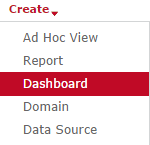
To create a new dashboard, click on Create → Dashboard in the top menu.
The page appearing next is referred to as the dashboard designer.
The Dashboard Designer
The dashboard designer allows the creation of new and editing of already existing dashboards. A dashboard is composed of several content elements, new or existing ones. The functionality of the dashboard designer is best explained by going through its different sections.
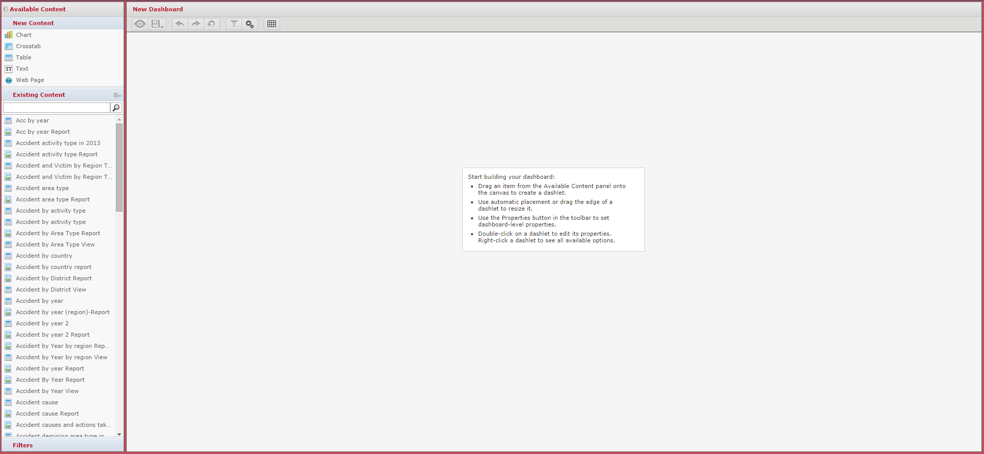
New Content
Elements from this section can be dropped into the bigger main dashboard pane to create new content. New content can be of one of the following types:
- Chart: this element allows to add a new chart (ad-hoc view) i.e. one that is not yet in the system and thus not available in the Existing Content pane. When dropping the new chart element to the main dashboard pane, the ad-hoc view designer overlays the dashboard designer - i.e. data has to be chosen, and a chart has to be defined, as described in Creating Ad Hoc Views in MINT. The resulting chart is then saved to the dashboard as a so-called dashlet. This means that the element is then only available in the context of that dashboard, but cannot be reused in others, and cannot be executed separately. It is therefore recommended to use this method only for very specific charts that shall only be used in one single dashboard. Normally, the preferred way is to create and ad-hoc view and save it in the repository so that it can be accessed directly and used in one or several reports and dashboards.

- Crosstab: same as above, except that the created dashlet is a crosstab rather than a chart.
- Table: same as above, except that the created dashlet is a table rather than a chart.
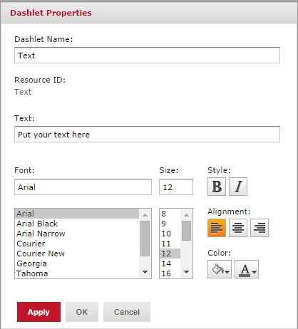
- Text: the text element allows to produce text to be displayed on the dashboard. When the element is dropped on the main dashboard pane, any text can be inputted into the text field.
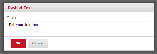
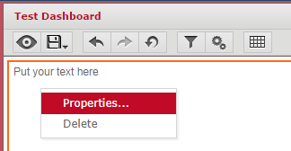
Once saved by clicking OK the element is available on the dashboard. Further properties (font, size, color, etc.) can then be set by right-clicking on the element and choosing Properties.
- Webpage: the webpage element allows to include an external web content into a dashboard. When the element is dropped on the main dashboard pane, any URL can be inputted into the URL field.

The result of the call to the specified URL will then be rendered on the dashboard.
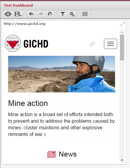
This method is particularly useful to include logos or other pictures that are accessible over the internet.
Existing Content
The Existing Content section lists all the content available within the repository that can be used on the dashboard. Usable content includes ad-hoc views and reports from within the organization and within the public folder (accessible to all users). The display of the existing content section can be switched between the default list view showing all available element in an alphabetical list, and the hierarchical folder view, showing the available elements according to their location in the repository. Similarly, only ad-hoc views, only report, or all elements can be displayed.
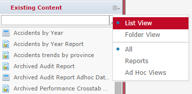
Elements can simply be dragged and dropped from the existing content section to the main dashboard pane. Elements can be placed anywhere and in any order on the main dashboard pane, and the designer will automatically allocate space and resize the elements accordingly. Elements can also be resized manually be their borders. Additionally, by right-clicking on an element, certain properties can be set, depending on its type.
Filters
The filter pane can be found in the bottom left corner of the dashboard designer. If the dashboard is empty and/or if none of its elements have any filter/input control defined, then the filter pane is collapsed and no filters are visible. As soon as one element on the dashboard has a filter/input control, then this filter appears in the filter pane. In the following example, two elements on the dashboard have a filters: the chart Areasize by province test has a filter on Province and the chart Accidents by province test also has a filter on Province and an additional one to restrict the date (date of accident is after a specified date).
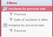
These filters can now be used as dashboard controls. If the two filters (Province and Date of accident is after) are dragged and dropped on the main dashboard pane, the result looks as follows:

Then, by clicking on the filter/parameter mapping icon in the top menu of the dashboard designer (![]() ), the filters can further be refined with the Parameter mapping dialog. In this window, it can be specified exactly which filter should be applied to which element (dashlet), via which attribute. Of course, the attribute must be defined on the underlying element (ad-hoc view). The following example shows the configuration for the scenario mentioned above:
), the filters can further be refined with the Parameter mapping dialog. In this window, it can be specified exactly which filter should be applied to which element (dashlet), via which attribute. Of course, the attribute must be defined on the underlying element (ad-hoc view). The following example shows the configuration for the scenario mentioned above:
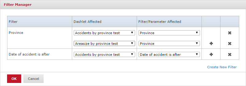
Then, once the dashboard is saved and executed, the filters can be applied as input controls, and the content of the affected elements will be refreshed accordingly.
Menus and options
At the top of the main dashboard pane the following buttons are available:

- Eye icon: allows to switch between designer and preview mode (to get an idea of how the dashboard will look like for the end user, and how the filters work).
- Save/Save As icon: allows to save a dashboard.
- Arrow to the left: allows to undo the last change.
- Arrow to the right: allows to redo the last change.
- Arrow downwards: allows to reset the dashboard to its last saved state.
- Logical tree icon: opens the Parameter mapping dialog (see section above on #Filters)
- Gear-wheel icon: opens the dashboard properties dialog that allows to specify various options:
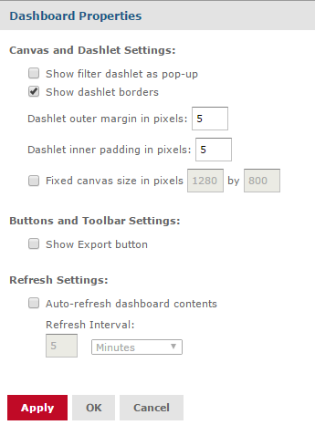
- Grid: allows to enable/disable the grid overlay that may help arranging and aligning items on a dashboard.
Save a dashboard
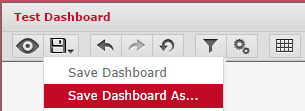
Once the editing of the dashboard is done, it may be saved/saved as into the repository by clicking on the save button in the top menu. When first saved or later on saved as, a repository location has to be specified.
Edit a dashboard
To edit a dashboard, navigate to its place in the repository, right-click on it and select Open in Designer.... The dashboard designer then opens and allows to change, add and remove elements.
