Difference between revisions of "Widgets in NG and IRE"
From IMSMA Wiki
| (One intermediate revision by the same user not shown) | |||
| Line 33: | Line 33: | ||
| Bold 10 | | Bold 10 | ||
|- | |- | ||
| − | | | + | | Note that rows are higher and the columns have fixed width in IRE. The widgets in Land, Activity and Accident are slightly different. |
| [[Image:Ord widget NG.png|400px]] | | [[Image:Ord widget NG.png|400px]] | ||
| [[Image:Ord widget RE.png|400px]] | | [[Image:Ord widget RE.png|400px]] | ||
| Line 63: | Line 63: | ||
{{NavBox IMSMA Remote Entry}} | {{NavBox IMSMA Remote Entry}} | ||
| − | [[Category: | + | [[Category:NAA]] |
Latest revision as of 07:53, 24 June 2016
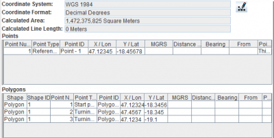
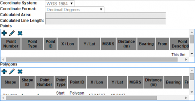
The templates will look different in different browsers. In addition users preferences/colour schemes may also effect how the templates look like. The pictures below are taken with IRE running with Google Chrome browser.
The design decision in IMSMANG effects how the fields will looks like in IRE. The widgets in IRE are more basic since they are designed for being functional in many different browsers. IMSMANG is also more forgiving if a widget is not complete than IRE.


