Difference between revisions of "Summarize iReport Template Data"
(→Charts) |
|||
| (32 intermediate revisions by 5 users not shown) | |||
| Line 1: | Line 1: | ||
| − | |||
{{TOC right}} | {{TOC right}} | ||
| − | |||
| − | |||
| − | |||
| − | |||
| − | |||
| − | |||
| − | |||
| − | |||
| − | == | + | ==Summarising Report Data==__NOEDITSECTION__ |
| − | In addition to displaying report details in an iReport template, the iReport Designer allows | + | In addition to displaying report details in an iReport template, the iReport Designer allows creating summaries or calculations of data returned in the report. These can take the form of totals, sums, and counts (stored in variables), or more complicated data summaries such as crosstabs or charts. Because summarizing data necessarily depends on multiple records, data summaries must exist in bands ''after'' the Detail band such as the Summary band, Footer band, or Group Footer bands. |
===Adding a Footer or Summary Section to the Report===__NOEDITSECTION__ | ===Adding a Footer or Summary Section to the Report===__NOEDITSECTION__ | ||
| Line 29: | Line 20: | ||
</ol> | </ol> | ||
| − | [[Image:iRep22.png|center|500px|'' | + | [[Image:iRep22.png|center|500px|''REPORT_COUNT element in summary section'']] |
<div align="center"> | <div align="center"> | ||
| − | '' | + | ''REPORT_COUNT element in summary section'' |
</div> | </div> | ||
| Line 40: | Line 31: | ||
</ol> | </ol> | ||
| − | {{note|It may be helpful to add a text label beside any counts that you add to report to identify the value. To add a text label, drag the text | + | {{note|It may be helpful to add a text label beside any counts that you add to the report to identify the value. To add a text label, drag the static text element [[Image:iRepText.png]] from the '''Palette''' pane. }} |
===Displaying Totals===__NOEDITSECTION__ | ===Displaying Totals===__NOEDITSECTION__ | ||
| Line 54: | Line 45: | ||
To create a custom variable: | To create a custom variable: | ||
| − | # Follow the steps to [[Modify an iReport Template#Adding a Variable to an iReport Template| add a variable to an iReport]] | + | # Follow the steps to [[Modify an iReport Template#Adding a Variable to an iReport Template| add a variable to an iReport]]. |
# From the '''Calculation Type''' list in the '''Properties''' pane, select the calculation that you would like to perform. | # From the '''Calculation Type''' list in the '''Properties''' pane, select the calculation that you would like to perform. | ||
| Line 84: | Line 75: | ||
|- | |- | ||
| System || No calculation is made. Instead the last value is stored. | | System || No calculation is made. Instead the last value is stored. | ||
| + | |- | ||
| + | | First || No calculation is made. Instead the first value is stored. | ||
|} | |} | ||
</center> | </center> | ||
| Line 94: | Line 87: | ||
{| class="wikitable" width="600" | {| class="wikitable" width="600" | ||
|- | |- | ||
| − | | align="center" colspan="2" | ''' | + | | align="center" colspan="2" | '''Reset Types''' |
|- | |- | ||
| width="150pt" | '''Reset Type''' | | width="150pt" | '''Reset Type''' | ||
| Line 141: | Line 134: | ||
|} | |} | ||
| − | ==Crosstabs== | + | ==Crosstabs==__NOEDITSECTION__ |
| − | In addition to summary variables, iReport provides the capability to build crosstab tables that display data in a grid for easy analysis and summary. Crosstabs allow you to choose data rows, columns, and the variable to measured and then automatically produce a grid of results for display in a chart. As with other summary variables Crosstabs are generally used in the '''Summary Band''' in a report. | + | In addition to summary variables, iReport provides the capability to build crosstab tables that display data in a grid for easy analysis and summary. Crosstabs allow you to choose data rows, columns, and the variable to be measured and then automatically produce a grid of results for display in a chart. As with other summary variables Crosstabs are generally used in the '''Summary Band''' in a report. |
To create a Crosstab: | To create a Crosstab: | ||
| Line 154: | Line 147: | ||
# Select the '''Field''' or '''Variable''' to use to represent the data in the grid. Typically this is a numeric field (e.g. areaSize) or if a count of the records is desired, the ''REPORT_COUNT'' variable. | # Select the '''Field''' or '''Variable''' to use to represent the data in the grid. Typically this is a numeric field (e.g. areaSize) or if a count of the records is desired, the ''REPORT_COUNT'' variable. | ||
#: [[Image:IReport Crosstab4.png|center|500px|''Crosstab wizard'']]<div align="center">''Crosstab wizard''</div> | #: [[Image:IReport Crosstab4.png|center|500px|''Crosstab wizard'']]<div align="center">''Crosstab wizard''</div> | ||
| − | # | + | # Finalise the Crosstab display. |
#: [[Image:IReport Crosstab5.png|center|500px|''Crosstab wizard'']]<div align="center">''Crosstab wizard''</div> | #: [[Image:IReport Crosstab5.png|center|500px|''Crosstab wizard'']]<div align="center">''Crosstab wizard''</div> | ||
# The Crosstab displays. | # The Crosstab displays. | ||
| Line 162: | Line 155: | ||
[[Image:IReport Crosstab7.png|center|500px|''Crosstab Preview'']]<div align="center">''Example Crosstab Preview''</div> | [[Image:IReport Crosstab7.png|center|500px|''Crosstab Preview'']]<div align="center">''Example Crosstab Preview''</div> | ||
| − | ==Charts== | + | ==Charts==__NOEDITSECTION__ |
Charts provide a visual representation of the report data. Before you add a chart to your report, you should ensure that your report contains the following: | Charts provide a visual representation of the report data. Before you add a chart to your report, you should ensure that your report contains the following: | ||
| Line 170: | Line 163: | ||
===Pie Chart===__NOEDITSECTION__ | ===Pie Chart===__NOEDITSECTION__ | ||
| + | ====Add a Pie Chart====__NOEDITSECTION__ | ||
To add a pie chart to the report: | To add a pie chart to the report: | ||
| − | #Create a report which groups the results by the attribute on which you would like to base your chart (e.g. ''status'') | + | #Create a report which groups the results by the attribute on which you would like to base your chart (e.g. ''status''). |
#Ensure that the Summary Band is available on the iReport template canvas. | #Ensure that the Summary Band is available on the iReport template canvas. | ||
#[[Modify_an_iReport_Template#Adding a Variable to an iReport Template|Create a Variable]] to contain the values to be displayed in the chart (e.g. ''SUM_areaSize_byStatus''). This variable should be based on a numeric field (e.g. ''areaSize'') and should have the '''Reset type''' set to '''Group''' and the group selected set to the field you wish to create the chart from'' (e.g. ''status''). | #[[Modify_an_iReport_Template#Adding a Variable to an iReport Template|Create a Variable]] to contain the values to be displayed in the chart (e.g. ''SUM_areaSize_byStatus''). This variable should be based on a numeric field (e.g. ''areaSize'') and should have the '''Reset type''' set to '''Group''' and the group selected set to the field you wish to create the chart from'' (e.g. ''status''). | ||
| Line 181: | Line 175: | ||
# The next step is to provide the correct data for the chart to use. Pie Charts require a '''unique identifier''' and a '''numeric''' value where the unique identifier is the field to group the data by (i.e. the names of the wedges) and numeric value is the value to sum. | # The next step is to provide the correct data for the chart to use. Pie Charts require a '''unique identifier''' and a '''numeric''' value where the unique identifier is the field to group the data by (i.e. the names of the wedges) and numeric value is the value to sum. | ||
#:[[Image:iReport Charts3.png|center|500px|''Chart options'']]<div align="center">''Chart options''</div> | #:[[Image:iReport Charts3.png|center|500px|''Chart options'']]<div align="center">''Chart options''</div> | ||
| − | # To select the '''unique value''' choose the '''Expression editor''' button and '''choose the ''field'' the report is grouped by''' (e.g. ''status''). Note that charts in iReport will fail if the '''unique value''' is null. In order to account for null values, you will need to modify the expression so that null values are grouped into their own group. The expression should be modified to include the bolded text below | + | # To select the '''unique value''' choose the '''Expression editor''' button and '''choose the ''field'' the report is grouped by''' (e.g. ''status''). Note that charts in iReport will fail if the '''unique value''' is null. In order to account for null values, you will need to modify the expression so that null values are grouped into their own group. The expression should be modified to include the bolded text below. |
#: '''$F{status} == null ? "N/A" : $F{status}''' | #: '''$F{status} == null ? "N/A" : $F{status}''' | ||
#:[[Image:iReport Charts5.png|center|500px|''Set Unique Value'']]<div align="center">''Set Unique Value''</div> | #:[[Image:iReport Charts5.png|center|500px|''Set Unique Value'']]<div align="center">''Set Unique Value''</div> | ||
| − | #Next, select the '''numeric value''' that contains the desired numeric data for the chart. '''Note: This should always be the variable created in step 3 above''' (e.g. '' | + | #Next, select the '''numeric value''' that contains the desired numeric data for the chart. '''Note: This should always be the variable created in step 3 above''' (e.g. ''SUM_areaSize_byStatus''). |
#:[[Image:iReport Charts6.png|center|500px|''Select the desired numeric variable'']]<div align="center">''Select the desired numeric variable''</div> | #:[[Image:iReport Charts6.png|center|500px|''Select the desired numeric variable'']]<div align="center">''Select the desired numeric variable''</div> | ||
#Choose '''Next'''. | #Choose '''Next'''. | ||
| − | #:[[Image:iReport Charts7.png|center|500px|'' | + | #:[[Image:iReport Charts7.png|center|500px|''Chart Wizard Completed'']]<div align="center">''Chart Wizard Completed''</div> |
| − | # Choose '''Finish'''. | + | # Choose '''Finish''' and the iReport template displays with the Chart. |
| − | #:[[Image:iReport Charts8.png|center|500px|'' | + | #:[[Image:iReport Charts8.png|center|500px|''iReport displays with Chart'']]<div align="center">''iReport displays with Chart''</div> |
| − | + | # The report can now be previewed to ensure it is functioning as expected. | |
| − | + | #:[[Image:iReport ChartsPreview.png|center|500px|''Preview with Chart'']]<div align="center">''Preview with chart''</div> | |
| − | + | ====Modify a Pie Chart====__NOEDITSECTION__ | |
| − | + | Once a chart has been created in iReport Designer, its properties can be edited by selecting the '''Chart Data''' option on the right click menu and adjusting the values and properties. | |
| − | |||
| − | |||
| − | [[Image: | ||
| − | <div align="center"> | ||
| − | '' | ||
| − | </div> | ||
| − | < | + | To modify a chart: |
| − | < | + | # Right click on the chart in iReport Designer and select '''Chart Data''' from the menu. |
| − | + | # The Chart details window displays. | |
| − | < | + | #: [[Image:IReport ChartData1.png|center|500px|''Chart Data Properties'']]<div align="center">''Chart Data Properties''</div> |
| − | + | # To edit the main properties of the chart, select the '''Details tab'''. Additionally, this screen can be used to edit the reset type of the chart which is relevant if the chart is displayed on a band other than the summary band. | |
| + | # The '''Chart Details''' window displays. | ||
| + | #: [[Image:IReport ChartData2.png|center|500px|''Chart Data Properties'']]<div align="center">''Chart Data Properties''</div> | ||
| + | # In this window, the basic properties of the chart that were established in the Chart Wizard can be edited. These include: | ||
| + | #* '''Key Expression''': the field used to group data for charting purposes. To change the field, simply select another field. '''Note:''' The field must be used in the creation of the variable used in the value expression or the results will be incorrect. | ||
| + | #* '''Value Expression''': the variable used to store the data to be displayed in the chart. If changes are made this value it is recommended to edit the variable properties as well. | ||
| + | #* '''Label Expression''': the area used to define the labels for the chart. Any valid expression can be used here. See [[Summarize iReport Template Data#Variable Expressions|Variable Expressions]] for more details. | ||
| − | |||
| − | |||
| − | |||
| − | |||
| − | |||
| − | |||
| − | |||
| − | |||
| − | |||
| − | |||
| − | |||
| − | |||
===Bar Charts===__NOEDITSECTION__ | ===Bar Charts===__NOEDITSECTION__ | ||
| + | Bar charts, unlike Pie Charts, have a third variable option that can be included in the report. In addition to the category and value expressions, bar charts add the option of a '''''series'''''. The series choice adds an additional possibility of grouping data though is not required. | ||
| − | + | ====Add a Bar Chart====__NOEDITSECTION__ | |
| − | |||
To add a bar chart to the report: | To add a bar chart to the report: | ||
| − | + | #Create a report which groups the results by the attribute on which you would like to base your chart (e.g. ''status'') | |
| − | + | #Ensure that the Summary Band is available on the iReport template canvas. | |
| − | + | #[[Modify_an_iReport_Template#Adding a Variable to an iReport Template|Create a Variable]] to contain the values to be displayed in the chart (e.g. ''SUM_areaSize_byStatus''). This variable should be based on a numeric field (e.g. ''areaSize'') and should have the '''Reset type''' set to '''Group''' and the group selected set to the field you wish to create the chart from'' (e.g. ''status''). | |
| − | + | #Select the '''Chart''' option from the '''Palette''' pane and drag it to the '''Summary Band''' of the report template to start the '''Chart Wizard'''. | |
| − | + | #Select one of the bar chart options. | |
| − | + | #:[[Image:IReport BarChart.png|center|500px|''Chart options'']]<div align="center">''Chart options''</div> | |
| − | + | #Choose Main report dataset. | |
| − | + | #:[[Image:IReport BarChart_Step1.png|center|500px|''Chart options'']]<div align="center">''Chart options''</div> | |
| − | + | # Provide a '''Series Expression''' (''optional''). | |
| − | + | #:[[Image:iReport Chart Bar1.png|center|500px|''Series Expression'']]<div align="center">''Series Expression''</div> | |
| − | + | # The Series Expression allows you to define an added level of detail to your bar chart (if desired). To select the '''Series''' choose the '''Expression editor''' button and '''choose one of the ''fields'' the report is grouped by''' (e.g. ''status''). Note that charts in iReport will fail if the '''Series''' value is null. In order to account for null values, you will need to modify the expression so that null values are grouped into their own group. The expression should be modified to include the bolded text below. You should replace the field the name of the field that you selected above. | |
| − | + | #: '''$F{status} == null ? "N/A" : $F{status}''' | |
| − | + | #:[[Image:iReport Charts5.png|center|500px|''Set Series Value'']]<div align="center">''Set Series Value''</div> | |
| − | : | + | #: The expression that you enter in the Series Expression field will vary based on how you want the horizontal axis to appear: |
| − | < | + | #*If you would like the horizontal axis of the bar chart to reflect a single attribute such as the chart displayed below, the Series Expression will be the same as the Category expression. |
| − | + | #:[[Image:iRep30.png|center|500px|''Bar chart –Single attribute y-axis'']]<div align="center">''Bar chart –Single attribute y-axis''</div> | |
| − | + | #*If you would like the horizontal axis of the bar chart to reflect the values of an additional attribute, the Series Expression would be the expression for the secondary level of detail. In the example shown below, the x-axis reflects the land priorities (e.g., Low, Medium, or High). In addition to displaying the priority, the bars of the chart use a different colour to reflect those land which block water access (red) vs. those that do not block the water (blue). | |
| − | + | #:[[Image:iRep31.png|center|500px|''Bar chart with different series expression'']]<div align="center">''Bar chart with different series Expression''</div> | |
| − | + | #* '''Finally, the Series value can be left blank if desired.''' | |
| − | + | # The next step is to provide the correct data for the chart to use. Bar charts require a '''category expression''' and a '''value expression''' where the value expression is a field to group the data by (i.e. the names of the X axis) and value expression is the value to sum. | |
| − | + | #:[[Image:iReport Chart Bar2.png|center|500px|''Category and Values'']]<div align="center">''Category and Values''</div> | |
| − | + | # To select the '''category expression''' choose the '''Expression editor''' button and '''choose one of the ''fields'' the report is grouped by''' (e.g. ''status''). Note that charts in iReport will fail if the '''category expression''' is null. In order to account for null values, you will need to modify the expression so that null values are grouped into their own group. The expression should be modified to include the bolded text below. You should replace field with the field that you selected above. | |
| − | + | #: '''$F{status} == null ? "N/A" : $F{status}''' | |
| − | + | #:[[Image:iReport Charts5.png|center|500px|''Set Category Expression'']]<div align="center">''Set Category Expression''</div> | |
| − | + | #Next, select the '''value expression''' that contains the desired numeric data for the chart. '''Note: This should always be one of the variables created in step 3 above''' (e.g. ''SUM_status_byAreaSize''). | |
| − | + | #:[[Image:iReport Charts6.png|center|500px|''Select the desired value expression'']]<div align="center">''Select the desired value expression''</div> | |
| − | + | # Choose '''Finish''' and the iReport template displays with the Chart. | |
| − | + | #:[[Image:iReport Chart Bar3.png|center|500px|''iReport displays with Chart'']]<div align="center">''iReport displays with Chart''</div> | |
| − | + | # The report can now be previewed to ensure it is functioning as expected. | |
| − | $F{ | + | #:[[Image:iReport Chart BarPreview.png|center|500px|''Preview with Chart'']]<div align="center">''Preview with chart''</div> |
| − | < | ||
| − | |||
| − | The expression that you enter in the Series Expression field will vary based on how you want the horizontal axis to appear: | ||
| − | *If you would like the horizontal axis of the bar chart to reflect a single attribute such as the chart displayed below, the Series Expression will be the same as the Category expression. | ||
| − | |||
| − | |||
| − | [[Image:iRep30.png|center|500px|'' | ||
| − | <div align="center"> | ||
| − | '' | ||
| − | </div> | ||
| − | |||
| − | |||
| − | *If you would like the horizontal axis of the bar chart to reflect the values of an additional attribute, the Series Expression would be the expression for the secondary level of detail. In the example shown below, the x-axis reflects the land priorities (e.g., Low, Medium, or High). In addition to displaying the priority, the bars of the chart use a different colour to reflect those land which block water access (red) vs. those that do not block the water (blue). | ||
| − | </ | ||
| − | + | ====Modify a Bar Chart====__NOEDITSECTION__ | |
| − | + | Once a bar chart has been created in iReport Designer, its properties can be edited by selecting the '''Chart Data''' option on the right click menu and adjusting the values and properties. | |
| − | '' | ||
| − | |||
| − | + | To modify a bar chart: | |
| − | + | # Right click on the chart in iReport Designer and select '''Chart Data''' from the menu. | |
| − | + | # The Chart Data properties display. | |
| − | + | # To edit the main properties of the chart, select the '''Details tab'''. Additionally, this screen can be used to edit the reset type of the chart which is relevant if the chart is displayed on a band other than the summary band. | |
| − | + | # The '''Chart Details''' window displays | |
| − | + | #: [[Image:IReport Chart Bar ChartData1.png|center|500px|''Chart Data Properties'']]<div align="center">''Chart Data Properties''</div> | |
| − | + | # For Bar Charts this presents the '''Category Series''' chooser. Typically there will be only one or two series to choose from here though more can be added at this point. Select the series to modify and choose '''Modify'''. | |
| − | + | # The Chart Data properties window will display | |
| − | + | #: [[Image:IReport Chart Bar ChartData2.png|center|500px|''Chart Data Properties'']]<div align="center">''Chart Data Properties''</div> | |
| − | + | # In this window, the basic properties of the bar chart that were established in the Chart Wizard can be edited. These include: | |
| − | + | #*'''Series Expression''': the field used to first group data for charting purposes. To change the field, simply select another field. '''Note:''' while this field is required it can be made blank or fixed by being set to a constant such as: "" or "Blank". | |
| − | + | #*'''Category Expression''': the field used to group data for charting purposes. To change the field, simply select another field. '''Note:''' The field must be used in the creation of the variable used in the value expression or the results will be incorrect. | |
| − | + | #* '''Value Expression''': the variable used to store the data to be displayed in the chart. If changes are made this value it is recommended to edit the variable properties as well. | |
| − | + | #* '''Label Expression''': the area used to define the labels for the chart. Any valid expression can be used here. See [[Summarize iReport Template Data#Variable Expressions|Variable Expressions]] for more details. | |
| − | |||
| − | |||
| − | |||
| − | |||
| − | |||
| − | |||
| − | |||
| − | |||
| − | |||
| − | |||
| − | |||
| − | |||
| − | |||
| − | |||
| − | |||
| − | |||
| − | |||
| − | |||
| − | |||
| − | |||
| − | |||
| − | |||
| − | |||
| − | |||
| − | |||
| − | |||
| − | |||
| − | |||
| − | |||
| − | |||
| − | |||
| − | |||
| − | |||
| − | |||
| − | |||
| − | |||
| − | |||
| − | |||
| − | |||
| − | |||
| − | |||
| − | |||
| − | '' | ||
| − | |||
| − | |||
| − | |||
| − | |||
| − | |||
| − | |||
| − | |||
| − | |||
| − | |||
| − | |||
| − | |||
| − | |||
| − | |||
| − | |||
| − | |||
| − | |||
| − | |||
| − | |||
| − | |||
| − | |||
| − | |||
| − | |||
| − | |||
| − | |||
| − | |||
| − | |||
| − | |||
| − | |||
| − | |||
| − | |||
| − | [[Image: | ||
| − | <div align="center"> | ||
| − | |||
| − | |||
| − | |||
| − | |||
| − | |||
| − | |||
| − | |||
| − | |||
| − | |||
| − | |||
| − | |||
| − | |||
| − | |||
| − | |||
| − | |||
| − | |||
| − | '' | ||
| − | |||
| − | |||
| − | |||
| − | |||
| − | |||
| − | |||
| − | |||
| − | |||
| − | : | ||
| − | |||
| − | |||
| − | |||
| − | |||
| − | |||
| − | [[Image: | ||
| − | <div align="center"> | ||
| − | '' | ||
| − | </div> | ||
| − | |||
| − | |||
| − | |||
| − | |||
| − | |||
| − | |||
| − | |||
| − | |||
| − | |||
| − | |||
| − | |||
| − | |||
| − | |||
| − | |||
| − | |||
| − | |||
| − | |||
| − | |||
| − | |||
| − | |||
| − | |||
| − | |||
| − | |||
| − | |||
| − | |||
| − | |||
| − | |||
| − | |||
| − | |||
| − | |||
| − | |||
| − | |||
| − | |||
| − | |||
| − | |||
| − | |||
| − | |||
| − | |||
| − | |||
| − | |||
| − | |||
| − | |||
| − | |||
| − | |||
| − | |||
| − | |||
| − | |||
| − | |||
| − | |||
| − | |||
| − | |||
| − | |||
| − | : | ||
| − | |||
| − | |||
| − | |||
| − | |||
| − | |||
| − | |||
| − | |||
| − | |||
| − | |||
| − | |||
| − | |||
| − | |||
| − | |||
| − | |||
| − | |||
| − | |||
| − | |||
| − | |||
| − | |||
| − | |||
| − | |||
| − | |||
| − | |||
| − | : | ||
| − | |||
| − | |||
| − | |||
| − | |||
| − | |||
| − | |||
| − | |||
| − | |||
| − | |||
| − | |||
| − | |||
| − | |||
| − | |||
| − | |||
| − | |||
| − | |||
| − | |||
| − | |||
| − | |||
| − | |||
| − | |||
| − | |||
| − | |||
| − | |||
| − | |||
| − | |||
| − | : | ||
| − | |||
| − | |||
| − | |||
| − | |||
| − | |||
| − | |||
| − | {{NavBox HowTo | + | {{NavBox HowTo Standardizing Data Analysis and Information Reporting}} |
| + | [[Category:NAA]] | ||
Latest revision as of 20:24, 20 February 2020
Summarising Report Data
In addition to displaying report details in an iReport template, the iReport Designer allows creating summaries or calculations of data returned in the report. These can take the form of totals, sums, and counts (stored in variables), or more complicated data summaries such as crosstabs or charts. Because summarizing data necessarily depends on multiple records, data summaries must exist in bands after the Detail band such as the Summary band, Footer band, or Group Footer bands.
Totals, averages, and other summary data are typically found at the end of a grouping or at the end of a report. If a desired band is not visible on the iReport Designer canvas:
- Select the desired band in the Report Inspector
- In the Properties pane, change the Band Height property to something more than 0 (e.g. 50).
Displaying Counts
iReport has a built-in variable for calculating the number of records in a report and the number of records in each group if the report contains groups. The number of records in the report is stored in the REPORT_COUNT variable. The number of records in each group is stored in the <GroupField>_COUNT where GroupField is the name of the field on which the group is created.
To display one of the built-in count variables in the report:
- Expand the appropriate section to the report. If you would like to add the number of records in the report, you will need to expand the summary section of the report. If you would like to add the number of records for each group, you will need to expand the <GroupField>Footer section.
- From the Report Inspector, select Variables.
- The REPORT_COUNT variable will always be available in the Variables list. The variable to display the count for the group will only be displayed if the report contains groups.
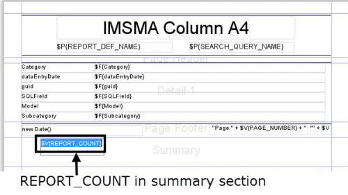
- To display the number of records in your report, drag the REPORT_COUNT variable to the summary section of the report.
REPORT_COUNT element in summary section
- To display the number of records in each group, drag the <GroupName>_COUNT variable to the <GroupName>Footer section.
| |
It may be helpful to add a text label beside any counts that you add to the report to identify the value. To add a text label, drag the static text element |
Displaying Totals
iReport allows you to display the total of a particular attribute in the report. This is done by creating a variable to store the total value (see Adding a Variable to an iReport).
To display a total:
- Ensure that a group footer or summary section has been added to the report.
- From the Report Inspector pane, choose Variables and drag the variable to the summary section. If you drag it to the footer, the total for the values in the group will be calculated. If you drag it to the summary, the total for all values will be calculated.
In addition to the built-in functions to calculate the number of records and the sum of a field, iReport also allows you to define other types of variable calculations. A variable is a named object that stores the result of a calculation. iReport allows you to define new variables and how those variables should be calculated. For example, you may define a variable that calculates the average for a particular field such as the area size. Or, you may wish to display the maximum value of a field. In these situations, you may define a custom variable.
To create a custom variable:
- Follow the steps to add a variable to an iReport.
- From the Calculation Type list in the Properties pane, select the calculation that you would like to perform.
| Calculation types | |
| Calculation type | Description |
| None | No type calculation performed. |
| Count | Counts the number of non-null results. |
| Distinct count | Counts the number of unique results. |
| Sum | Adds the values together. |
| Average | Averages the values together. |
| Lowest | Returns the lowest value. |
| Highest | Returns the highest value. |
| Standard deviation | Returns the standard deviation of all values. |
| Variance | Returns the variance of all values. |
| System | No calculation is made. Instead the last value is stored. |
| First | No calculation is made. Instead the first value is stored. |
- From the Reset Type list, select when a variable value should be reset to the initial value. For example, suppose you wanted to count the number of accidents in each location. Each time a new group—in this case a location—is encountered, the variable should be reset. To do this, you would need to reset the value of the variable after each group.
| Reset Types | |
| Reset Type | Description |
| None | The initial value is always ignored. |
| Report | The variable is initialised once at the beginning of the report using the Initial Expression value. |
| Page | The variable is initialised at the top of each new page. |
| Column | The variable is initialised in each new column. |
| Group | The variable is initialised at each new group. |
- If you select Group as the Reset Type, you will need to select the group on which you would like to reset the variable from the Reset Group list. The Reset Group list will contain all fields on which the report is grouped.
| |
If the field on which the variable should be reset is not listed in the Reset Group list, be sure that the field is included as one of the grouping levels for the report. |
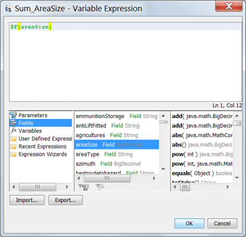
- The Variable Expression field specifies the expression that will be provided to the variable. Typically, this will be the value of a field in the report. To specify a field in the report edit the Variable Expression field.
Variable Expression Editor
In addition to the summary functions available on the variable, specific expressions can be used in the Expression Editor to define values. For example:
| Expression Operations | |
| Operation | Expression |
| Division | $F{areaSize}/$V{REPORT_COUNT} |
| Addition | $F{areaSize} + 500.0 |
| Subtraction | $F{areaSize} - $P{ClearedArea} |
| Multiplication | $F{areaSize} * $V{REPORT_COUNT} |
| Concatenation (string only) | $F{localId} + $P{LocationName} |
Crosstabs
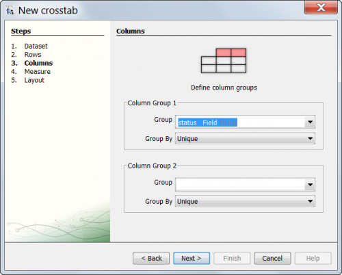
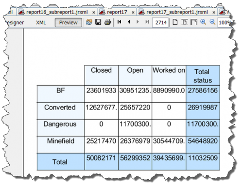
In addition to summary variables, iReport provides the capability to build crosstab tables that display data in a grid for easy analysis and summary. Crosstabs allow you to choose data rows, columns, and the variable to be measured and then automatically produce a grid of results for display in a chart. As with other summary variables Crosstabs are generally used in the Summary Band in a report.
To create a Crosstab:
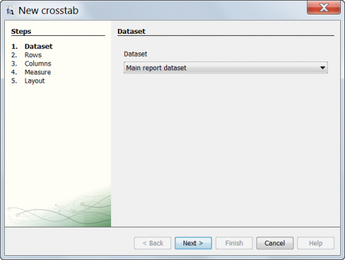
- In the Palette pane, drag a Crosstab item to the Summary Band of the report.
- The Crosstab wizard displays
- Crosstab wizard
-
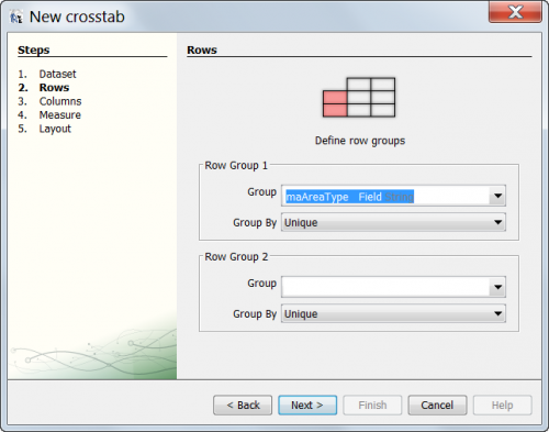
- Select the Field to use in the Row of the Crosstab grid.
- Crosstab wizard
-
- Select the Field to use in the Column of the Crosstab grid.
- Crosstab wizard
-
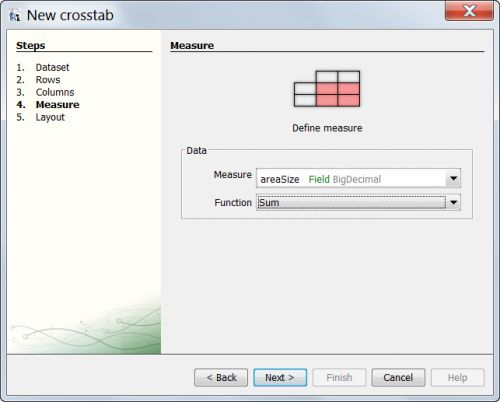
- Select the Field or Variable to use to represent the data in the grid. Typically this is a numeric field (e.g. areaSize) or if a count of the records is desired, the REPORT_COUNT variable.
- Crosstab wizard
-
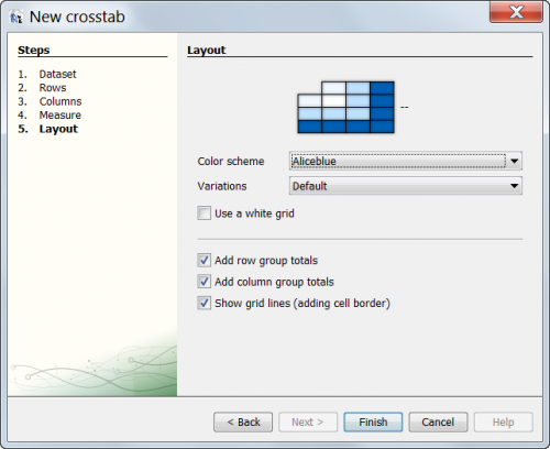
- Finalise the Crosstab display.
- Crosstab wizard
-
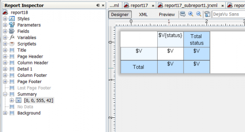
- The Crosstab displays.
- Crosstab wizard
-
The report can now be run or additional adjustments to the report can be made including resizing columns and rows, number formatting, or display adjustments.
Charts
Charts provide a visual representation of the report data. Before you add a chart to your report, you should ensure that your report contains the following:
- At least one grouping. The report groupings are used by iReport to determine what fields may be plotted. See Modify an iReport Template for more information on grouping.
- At least one variable that contains a calculation. This calculation may be a count, total, or other custom calculation. These calculated variables define the size of the chart segment. The Reset type of this calculation should be set to Group and use the report grouping defined in #1. See Modify an iReport Template for more information on adding variables.
Pie Chart
Add a Pie Chart
To add a pie chart to the report:
- Create a report which groups the results by the attribute on which you would like to base your chart (e.g. status).
- Ensure that the Summary Band is available on the iReport template canvas.
- Create a Variable to contain the values to be displayed in the chart (e.g. SUM_areaSize_byStatus). This variable should be based on a numeric field (e.g. areaSize) and should have the Reset type set to Group and the group selected set to the field you wish to create the chart from (e.g. status).
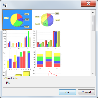
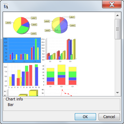
- Select the Chart option from the Palette pane and drag it to the Summary Band of the report template to start the Chart Wizard.
- Select one of the pie chart options.
- Chart options
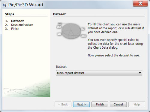
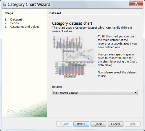
- Choose Main report dataset.
- Chart options
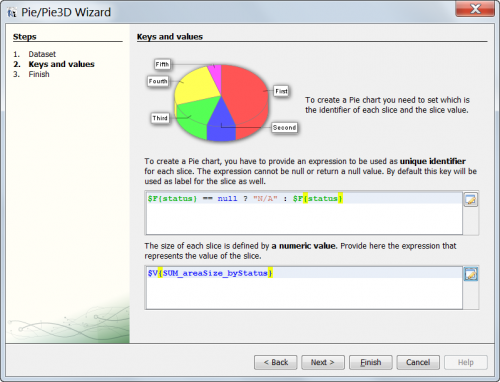
- The next step is to provide the correct data for the chart to use. Pie Charts require a unique identifier and a numeric value where the unique identifier is the field to group the data by (i.e. the names of the wedges) and numeric value is the value to sum.
- Chart options
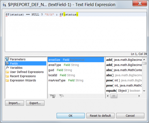
- To select the unique value choose the Expression editor button and choose the field the report is grouped by (e.g. status). Note that charts in iReport will fail if the unique value is null. In order to account for null values, you will need to modify the expression so that null values are grouped into their own group. The expression should be modified to include the bolded text below.
- $F{status} == null ? "N/A" : $F{status}
- Set Unique Value
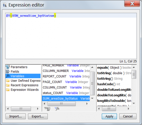
- Next, select the numeric value that contains the desired numeric data for the chart. Note: This should always be the variable created in step 3 above (e.g. SUM_areaSize_byStatus).
- Select the desired numeric variable
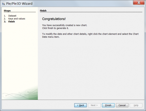
- Choose Next.
- Chart Wizard Completed
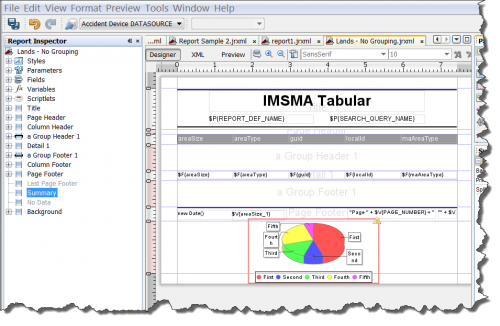
- Choose Finish and the iReport template displays with the Chart.
- iReport displays with Chart
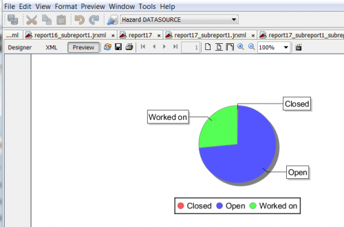
- The report can now be previewed to ensure it is functioning as expected.
- Preview with chart
Modify a Pie Chart
Once a chart has been created in iReport Designer, its properties can be edited by selecting the Chart Data option on the right click menu and adjusting the values and properties.
To modify a chart:
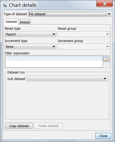
- Right click on the chart in iReport Designer and select Chart Data from the menu.
- The Chart details window displays.
- Chart Data Properties
-
- To edit the main properties of the chart, select the Details tab. Additionally, this screen can be used to edit the reset type of the chart which is relevant if the chart is displayed on a band other than the summary band.
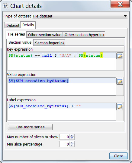
- The Chart Details window displays.
- Chart Data Properties
-
- In this window, the basic properties of the chart that were established in the Chart Wizard can be edited. These include:
- Key Expression: the field used to group data for charting purposes. To change the field, simply select another field. Note: The field must be used in the creation of the variable used in the value expression or the results will be incorrect.
- Value Expression: the variable used to store the data to be displayed in the chart. If changes are made this value it is recommended to edit the variable properties as well.
- Label Expression: the area used to define the labels for the chart. Any valid expression can be used here. See Variable Expressions for more details.
Bar Charts
Bar charts, unlike Pie Charts, have a third variable option that can be included in the report. In addition to the category and value expressions, bar charts add the option of a series. The series choice adds an additional possibility of grouping data though is not required.
Add a Bar Chart
To add a bar chart to the report:
- Create a report which groups the results by the attribute on which you would like to base your chart (e.g. status)
- Ensure that the Summary Band is available on the iReport template canvas.
- Create a Variable to contain the values to be displayed in the chart (e.g. SUM_areaSize_byStatus). This variable should be based on a numeric field (e.g. areaSize) and should have the Reset type set to Group and the group selected set to the field you wish to create the chart from (e.g. status).
- Select the Chart option from the Palette pane and drag it to the Summary Band of the report template to start the Chart Wizard.
- Select one of the bar chart options.
- Chart options
- Choose Main report dataset.
- Chart options
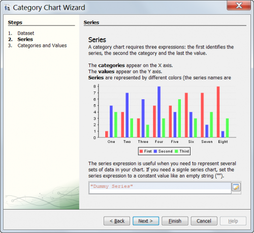
- Provide a Series Expression (optional).
- Series Expression
- The Series Expression allows you to define an added level of detail to your bar chart (if desired). To select the Series choose the Expression editor button and choose one of the fields the report is grouped by (e.g. status). Note that charts in iReport will fail if the Series value is null. In order to account for null values, you will need to modify the expression so that null values are grouped into their own group. The expression should be modified to include the bolded text below. You should replace the field the name of the field that you selected above.
- $F{status} == null ? "N/A" : $F{status}
- Set Series Value
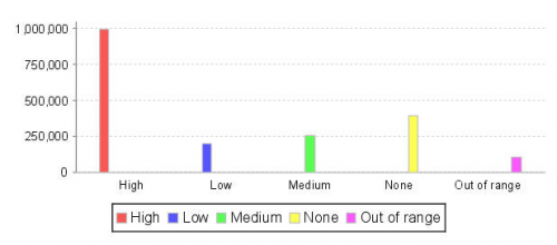
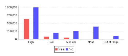
- The expression that you enter in the Series Expression field will vary based on how you want the horizontal axis to appear:
- If you would like the horizontal axis of the bar chart to reflect a single attribute such as the chart displayed below, the Series Expression will be the same as the Category expression.
- Bar chart –Single attribute y-axis
- If you would like the horizontal axis of the bar chart to reflect the values of an additional attribute, the Series Expression would be the expression for the secondary level of detail. In the example shown below, the x-axis reflects the land priorities (e.g., Low, Medium, or High). In addition to displaying the priority, the bars of the chart use a different colour to reflect those land which block water access (red) vs. those that do not block the water (blue).
- Bar chart with different series Expression
- Finally, the Series value can be left blank if desired.
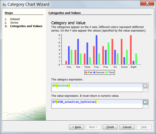
- The next step is to provide the correct data for the chart to use. Bar charts require a category expression and a value expression where the value expression is a field to group the data by (i.e. the names of the X axis) and value expression is the value to sum.
- Category and Values
- To select the category expression choose the Expression editor button and choose one of the fields the report is grouped by (e.g. status). Note that charts in iReport will fail if the category expression is null. In order to account for null values, you will need to modify the expression so that null values are grouped into their own group. The expression should be modified to include the bolded text below. You should replace field with the field that you selected above.
- $F{status} == null ? "N/A" : $F{status}
- Set Category Expression
- Next, select the value expression that contains the desired numeric data for the chart. Note: This should always be one of the variables created in step 3 above (e.g. SUM_status_byAreaSize).
- Select the desired value expression
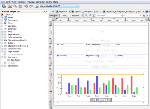
- Choose Finish and the iReport template displays with the Chart.
- iReport displays with Chart
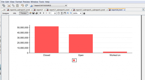
- The report can now be previewed to ensure it is functioning as expected.
- Preview with chart
Modify a Bar Chart
Once a bar chart has been created in iReport Designer, its properties can be edited by selecting the Chart Data option on the right click menu and adjusting the values and properties.
To modify a bar chart:
- Right click on the chart in iReport Designer and select Chart Data from the menu.
- The Chart Data properties display.
- To edit the main properties of the chart, select the Details tab. Additionally, this screen can be used to edit the reset type of the chart which is relevant if the chart is displayed on a band other than the summary band.
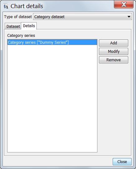
- The Chart Details window displays
- Chart Data Properties
-
- For Bar Charts this presents the Category Series chooser. Typically there will be only one or two series to choose from here though more can be added at this point. Select the series to modify and choose Modify.
- The Chart Data properties window will display
- Chart Data Properties
-
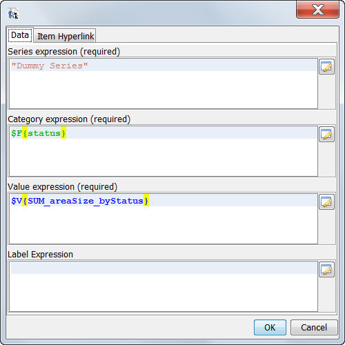
- In this window, the basic properties of the bar chart that were established in the Chart Wizard can be edited. These include:
- Series Expression: the field used to first group data for charting purposes. To change the field, simply select another field. Note: while this field is required it can be made blank or fixed by being set to a constant such as: "" or "Blank".
- Category Expression: the field used to group data for charting purposes. To change the field, simply select another field. Note: The field must be used in the creation of the variable used in the value expression or the results will be incorrect.
- Value Expression: the variable used to store the data to be displayed in the chart. If changes are made this value it is recommended to edit the variable properties as well.
- Label Expression: the area used to define the labels for the chart. Any valid expression can be used here. See Variable Expressions for more details.
| ||||||||||
