Difference between revisions of "Summarize iReport Template Data"
| Line 36: | Line 36: | ||
{{note|If the REPORT_COUNT element is dragged to a section of the report other than the summary, the value returned by the REPORT_COUNT variable will be determined by where it is placed. For example, if the REPORT_COUNT is placed in the pageFooter section, the value returned will be the number of records displayed so far.}} | {{note|If the REPORT_COUNT element is dragged to a section of the report other than the summary, the value returned by the REPORT_COUNT variable will be determined by where it is placed. For example, if the REPORT_COUNT is placed in the pageFooter section, the value returned will be the number of records displayed so far.}} | ||
| − | <ol> | + | <ol start="4"> |
<li>To display the number of records in each group, drag the <GroupName>_COUNT variable to the <''GroupName''>Footer section.</li> | <li>To display the number of records in each group, drag the <GroupName>_COUNT variable to the <''GroupName''>Footer section.</li> | ||
</ol> | </ol> | ||
Revision as of 14:16, 20 September 2013
| How To |
|---|
Summarizing Report Data
In addition to displaying report details in an iReport template, the iReport Designer allows you create summaries or calculations of data returned in the report. These can take the form of totals, sums, and counts (stored in Variables), or more complicated data summaries such as Crosstabs or Charts. Because summarizing data necessarily depends on multiple records, data summaries must exist in bands after the Detail band such as the Summary band, Footer bad, or Group Footer bands.
Totals, averages, and other summary data are typically found at the end of a grouping or at the end of a report. If a desired band is not visible on the iReport Designer canvas:
- Select the desired band in the Report Inspector
- In the Properties pane, change the Band Height property to something more than 0 (e.g. 50).
Displaying Counts
iReport has a built-in variable for calculating the number of records in a report and the number of records in each group if the report contains groups. The number of records in the report is stored in the REPORT_COUNT variable. The number of records in each group is stored in the <GroupField>_COUNT where GroupField is the name of the field on which the group is created.
To display one of the built-in count variables in the report:
- Expand the appropriate section to the report. If you would like to add the number of records in the report, you will need to expand the summary section of the report. If you would like to add the number of records for each group, you will need to expand the <GroupField>Footer section.
- From the Report Inspector, select Variables.
- The REPORT_COUNT variable will always be available in the Variables list. The variable to display the count for the group will only be displayed if the report contains groups.
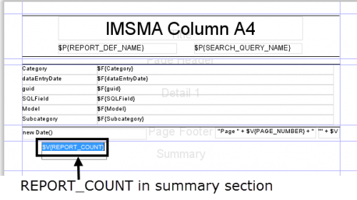
- To display the number of records in your report, drag the REPORT_COUNT variable to the summary section of the report.
Figure 22. REPORT_COUNT element in summary section
- To display the number of records in each group, drag the <GroupName>_COUNT variable to the <GroupName>Footer section.
| |
It may be helpful to add a text label beside any counts that you add to report to identify the value. To add a text label, click the |
Displaying Totals
iReport allows you to display the total of a particular attribute in the report. This is done by creating a variable to store the total value (see Adding a Variable to an iReport).
To display a total:
- Ensure that a group footer or summary section has been added to the report.
- From the Report Inspector pane, choose Variables and drag the variable to the summary section. If you drag it to the footer, the total for the values in the group will be calculated. If you drag it to the summary, the total for all values will be calculated.
In addition to the built-in functions to calculate the number of records and the sum of a field, iReport also allows you to define other types of variable calculations. A variable is a named object that stores the result of a calculation. iReport allows you to define new variables and how those variables should be calculated. For example, you may define a variable that calculates the average for a particular field such as the area size. Or, you may wish to display the maximum value of a field. In these situations, you may define a custom variable.
To create a custom variable:
- Follow the steps to add a variable to an iReport
- From the Calculation Type list in the Properties pane, select the calculation that you would like to perform.
| Calculation types | |
| Calculation type | Description |
| None | No type calculation performed. |
| Count | Counts the number of non-null results. |
| Distinct count | Counts the number of unique results. |
| Sum | Adds the values together. |
| Average | Averages the values together. |
| Lowest | Returns the lowest value. |
| Highest | Returns the highest value. |
| Standard deviation | Returns the standard deviation of all values. |
| Variance | Returns the variance of all values. |
| System | No calculation is made. Instead the last value is stored. |
- From the Reset Type list, select when a variable value should be reset to the initial value. For example, suppose you wanted to count the number of accidents in each location. Each time a new group—in this case a location—is encountered, the variable should be reset. To do this, you would need to reset the value of the variable after each group.
| Table 5. Reset Types | |
| Reset Type | Description |
| None | The initial value is always ignored. |
| Report | The variable is initialised once at the beginning of the report using the Initial Expression value. |
| Page | The variable is initialised at the top of each new page. |
| Column | The variable is initialised in each new column. |
| Group | The variable is initialised at each new group. |
- If you select Group as the Reset Type, you will need to select the group on which you would like to reset the variable from the Reset Group list. The Reset Group list will contain all fields on which the report is grouped.
| |
If the field on which the variable should be reset is not listed in the Reset Group list, be sure that the field is included as one of the grouping levels for the report. |
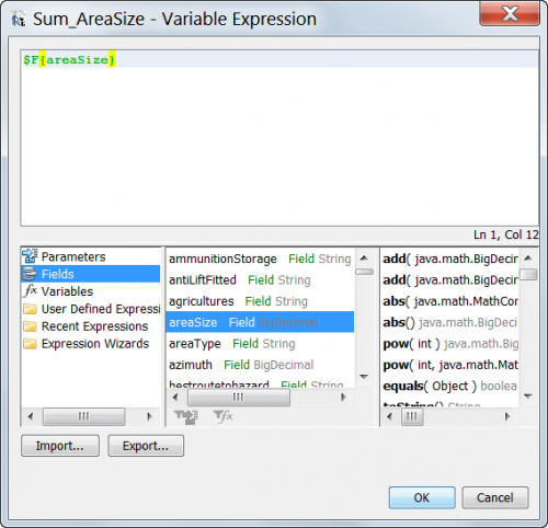
- The Variable Expression field specifies the expression that will be provided to the variable. Typically, this will be the value of a field in the report. To specify a field in the report edit the Variable Expression field.
Variable Expression Editor
In addition to the summary functions available on the variable, specific expressions can be used in the Expression Editor to define values. For example:
| Expression Operations | |
| Operation | Expression |
| Division | $F{areaSize}/$V{REPORT_COUNT} |
| Addition | $F{areaSize} + 500.0 |
| Subtraction | $F{areaSize} - $P{ClearedArea} |
| Multiplication | $F{areaSize} * $V{REPORT_COUNT} |
| Concatenation (string only) | $F{localId} + $P{LocationName} |
Crosstabs
In addition to summary variables, iReport provides the capability to build crosstab tables that display data in a grid for easy analysis and summary. Crosstabs allow you to choose data rows, columns, and the variable to measured and then automatically produce a grid of results for display in a chart. As with other summary variables Crosstabs are generally used in the Summary Band in a report.
To create a Crosstab:
- In the Palette pane, drag a Crosstab item to the Summary Band of the report.
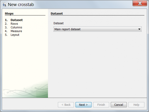
- The Crosstab wizard displays
- Crosstab wizard
-
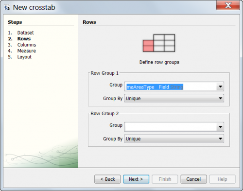
- Select the Field to use in the Row of the Crosstab grid.
- Crosstab wizard
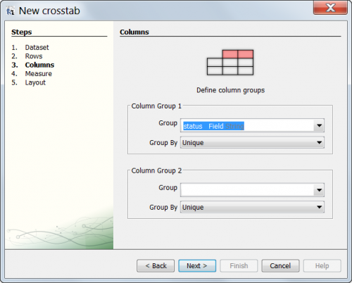
-
- Select the Field to use in the Column of the Crosstab grid.
- Crosstab wizard
-
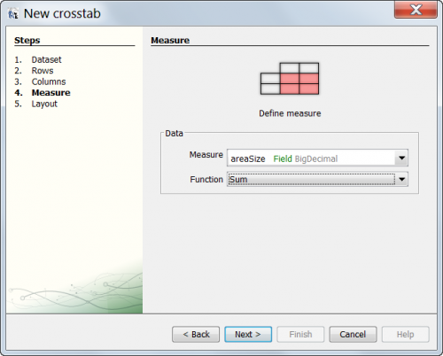
- Select the Field or Variable to use to represent the data in the grid. Typically this is a numeric field (e.g. areaSize) or if a count of the records is desired, the REPORT_COUNT variable.
- Crosstab wizard
-
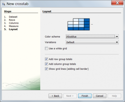
- Finalize the Crosstab display.
- Crosstab wizard
-
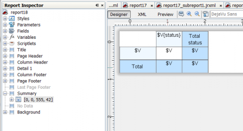
- The Crosstab displays.
- Crosstab wizard
-
The report can now be run or additional adjustments to the report can be made including resizing columns and rows, number formatting, or display adjustments.
Charts
Charts provide a visual representation of the report data. Before you add a chart to your report, you should ensure that your report contains the following:
- At least one grouping. The report groupings are used by iReport to determine what fields may be plotted.
- At least one variable that contains a calculation. This calculation may be a count, total, or other custom calculation. These calculated variables define the size of the chart segment.
Pie Chart
To add a pie chart to the report:
- Create a report which groups the results by the attribute on which you would like to base your chart.
- After creating the report, you should add a footer for the attribute on which the results will be grouped. This footer will be used to display the total for the group that will subsequently be used in the pie chart. To add a group footer:
- From the View menu, select Bands.
- The <FileName> bands… window displays.
- Select <GroupAttribute>Footer from the left pane where GroupAttribute is the name of the attribute on which the results will be grouped. For example, if you are creating a report on land and group the results by the priority, the name of the band would be priorityFooter.
- In the right pane, enter a numeric value in the Band Height field. You may adjust the height of the summary.
- Click the Apply button.
- Add a summary section to the report.
- Click the File:IRepBarChart.png icon.
- In the summary section of the report, hold down the mouse button and drag the cursor to form the rectangle which will contain the chart.
- A window of the various chart options displays.
- Select one of the pie chart options.
Figure 26. Pie chart options
- Click the OK button.
- Right-click anywhere on the chart.
- Select the Chart Properties option.
- From the Chart Properties window, select the Chart Data tab.
- From the Chart Data tab, select the Details tab.
- The Section Value tab should be selected by default. If it is not, select it.
- The Key Expression defines the various slices of the pie chart. This will typically be each unique value for an attribute. For example, if the chart were to contain the total area size of land with a particular priority, the Key Expression would return the unique values for priority (e.g., Low, Medium, or High). To enter the key expression value:
- Click the File:IRepEditor.png icon that is displayed beside the Key Expression field.
- The Expression editor window displays.
- From the bottom pane, double-click the name of the attribute that contains the data that you would like to include in the chart.
- The expression to represent the attribute displays in the top pane.
- In order to account for null values, you will need to modify the expression so that null values are grouped into their own group. The expression should be modified to include the bolded text below. You should replace attribute with the name of the attribute that you selected in step b above.
- $F{attribute} != null ? $F{attribute} : "Unknown"
- Click the Apply button.
- The Value Expression field contains the expression that returns the numeric value for the key. For example, it may be the total land size of high priority land.
- Click the File:IRepEditor.png icon that is displayed beside the Value Expression field.
- The Expression editor window displays.
- From the Objects and expressions tab, select Variables from the left pane.
- From the middle pane at the bottom of the Expression editor window, double-click the name of the variable that was created to store the total.
- Click the Apply button.
- The Label Expression field contains the expression that is used to determine the label for the segment of the pie chart. Because this expression will most likely be the same as the one used in the Key Expression, you can copy the expression from the Key Expression field and paste it into the Label Expression field.
- The following figure is an example of the Chart Properties window for a report that contains a pie chart which graphs the total area size of land based on their priority.
Figure 27. Chart Properties
- Click the Close button
- The Chart Properties window closes.
- Save the report by either clicking the icon, or by selecting the Save option from the File menu.
Below is an example of a report template that totals the area size of land by priority.
Figure 28. Sample report template with pie chart
The resulting report pages are shown below.
Figure 29. Sample report with pie chart
Bar Charts
| |
The sample report Bar Chart Sample.jrxm lin the <iReport Installation Directory>\iReports_IMSMA\IMSMA reports directory provides an example of a report that includes a bar chart. |
To add a bar chart to the report:
- Create a report which groups the results by the attribute on which you would like to base your chart.
- After creating the report, you should add a footer for the attribute on which the results will be grouped. This footer will be used to display the total for the group that will subsequently be used in the pie chart. To add a group footer:
- From the View menu, select Bands.
- The <FileName> bands… window displays.
- Select <GroupAttribute>Footer from the left pane where GroupAttribute is the name of the attribute on which the results will be grouped. For example, if you are creating a report on land and group the results by the priority, the name of the band would be priorityFooter.
- In the right pane, enter a numeric value in the Band Height field. You may adjust the height of the summary
- Click the Apply button.
- Add a summary section to the report.
- Click the File:IRepBarChart.png icon.
- In the summary section of the report, hold down the mouse button and drag the cursor to form the rectangle which will contain the chart.
- A window of the various chart options displays.
- Select one of the bar chart options.
- Click the OK button.
- Right-click anywhere on the chart.
- Select the Chart Properties option.
- From the Chart Properties window, select the Chart Data tab.
- From the Chart Data tab, select the Details tab.
- Click the Add button.
- The Chart Properties window displays. By default, the Data tab should be selected.
- The Series Expression allows you to define an added level of detail to your bar chart. To enter the series expression value:
- Click the File:IRepEditor.png icon that is displayed beside the Key Expression field.
- The Expression editor window displays.
- From the bottom pane, double-click the name of the attribute that contains the data that you would like to include in the chart.
- The expression to represent the attribute displays in the top pane.
- In order to account for null values, you will need to modify the expression so that null values are grouped into their own group. The expression should be modified to include the bolded text below. You should replace attribute with the name of the attribute that you selected in step b above.
- Click the Apply button.
- If you would like the horizontal axis of the bar chart to reflect a single attribute such as the chart displayed below, the Series Expression will be the same as the Category expression.
$F{attribute} != null ? $F{attribute} : "Unknown"
The expression that you enter in the Series Expression field will vary based on how you want the horizontal axis to appear:
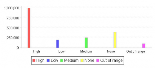
Figure 30. Bar chart –Single attribute y-axis
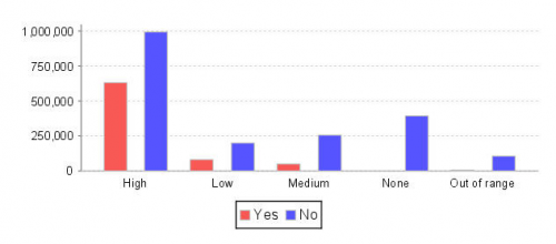
- If you would like the horizontal axis of the bar chart to reflect the values of an additional attribute, the Series Expression would be the expression for the secondary level of detail. In the example shown below, the x-axis reflects the land priorities (e.g., Low, Medium, or High). In addition to displaying the priority, the bars of the chart use a different colour to reflect those land which block water access (red) vs. those that do not block the water (blue).
Figure 31. Bar chart with different series expression
-
The Chart Properties window for this bar chart is shown below. Notice that the series expression and category expression differ.
Figure 32. Chart Properties – Different series and category expressions
- If you selected one of the stacked bar chart options, the series expression will be used to determine the segments of each bar. In the following figure, the series expression creates red and blue segments in each bar to indicate whether or not water access is blocked.
Figure 33. Stacked bar chart
- The Category Expression is the major grouping of the horizontal axis. To enter the category expression:
- Click the File:IRepEditor.png icon that is displayed beside the Category expression field.
- The Expression editor window displays.
- From the bottom pane, double-click the name of the attribute that contains the data that you would like to include in the chart.
- The expression to represent the attribute displays in the top pane.
- In order to account for null values, you will need to modify the expression so that null values are grouped into their own group. The expression should be modified to include the bolded text below. You should replace attribute with the name of the attribute that you selected in step b above.
- Click the Apply button.
- The Value Expression field contains the expression that returns the numeric value for the key.
- Click the File:IRepEditor.png icon that is displayed beside the Value Expression field.
- The Expression editor window displays.
- From the Objects and expressions tab, select Variables from the left pane.
- From the middle pane at the bottom of the Expression editor window, double-click the name of the variable that was created to store the total.
- Click the Apply button.
- Click the OK button.
- The Chart Properties window closes.
- Click the Close button.
- The Chart Properties window closes.
- Save the report by either clicking the File:IRepSave.png icon, or by selecting the Save option from the File menu.
$F{attribute} != null ? $F{attribute} : "Unknown"
Grouped Bar Chart
The horizontal axis of the bar charts discussed in the previous section compared the values of a single variable. For example, the bar chart below compares the number of different activity types.
Figure 34. Bar chart comparing values of a single variable
In this section, you will learn how to create a grouped bar chart. A grouped bar chart compares the values of a single variable in one group to the same variables in another group. In the example below, the grouped bar chart still compares the number of activity types. However, the chart also compares the number of activity types between the districts. The number of activity types (clearance, impact survey, technical survey, and road clearance) are represented by the different bar colours as indicated in the legend. The coloured bars are clustered together based on their district. The first cluster of bars shows the number of activity in the Bolikon district. The second cluster of bars shows the number of activities in the Waltern district.
Figure 35. Grouped bar chart comparing values of a single variable
The two main differences between adding a bar chart and a grouped bar chart are:
- The grouped bar chart requires that you specify at least two groupings for the report.
- The key expression and the category expression will differ; whereas, for a bar chart, the value for these expressions is the same.
To add a grouped bar chart to the report:
- Create a report which groups the results by the fields that will be represented on the horizontal axis of the chart.
| |
For a grouped bar chart, you will need to specify at least two groupings. |
- Add any variables that you may need to calculate the value that you would like to show on the chart.
- If you would like to display the calculated variable for each group, you should add the footer for the field on which the results will be grouped. This footer will be used to display the variable for the group that will subsequently be used in the chart. To add a group footer:
- From the View menu, select Bands.
- The <FileName> bands… window displays.
- Select <GroupFieldName>Footer from the left pane where GroupFieldNameis the name of the field on which the results will be grouped. For example, if you are creating a report on land and group the results by the priority, the name of the band would be priorityFooter.
- In the right pane, enter a numeric value in the Band Height field. You may adjust the height of the summary.
- Click the Apply button.
- Add a summary section to the report.
- Click the File:IRepBarChart.png icon.
- In the summary section of the report, hold down the mouse button and drag the cursor to form the rectangle which will contain the chart.
- A window of the various chart options displays.
- Select one of the bar chart options.
Figure 36. Bar chart options
- Click the OK button.
- Right-click anywhere on the chart.
- select the Chart Properties option.
- From the Chart Properties window, select the Chart Data tab.
- From the Chart Data tab, select the Details tab.
- Click the Add button.
- The Chart Properties window displays. By default, the Data tab should be selected.
- For a grouped bar chart, the series expression contains the field whose distinct values you would like to show via different colours on the bar chart.
Figure 37. Bar chart series expression
To enter the series expression:
- Click the File:IRepEditor.png icon that is displayed beside the Key Expression field.
- The Expression editor window displays.
- From the bottom pane, double-click the name of the field that contains the data that you would like to include in the chart.
- The expression to represent the field displays in the top pane.
- Click the Apply button.
- The Category Expression is the field by which the series expression is grouped together.
Figure 38. Bar chart category expression
To enter the category expression:
- Click the File:IRepEditor.png icon that is displayed beside the Category expression field.
- The Expression editor window displays.
- From the bottom pane, double-click the name of the field that contains the data that you would like to include in the chart.
- The expression to represent the field displays in the top pane.
- Click the Apply button.
- The Value Expression field contains the variable that returns the numeric value that will be represented on the chart.
- Click the File:IRepEditor.png icon that is displayed beside the Value Expression field.
- The Expression editor window displays.
- From the Objects and expressions tab, select Variables from the left pane.
- From the middle pane at the bottom of the Expression editor window, double-click the name of the variable that you would like to represent on the chart.
- Click the Apply button.
- Click the OK button.
- The Chart Properties window closes.
- Click the Close button.
- The Chart Properties window closes.
- Save the report by either clicking the File:IRepSave.png icon, or by selecting the Save option from the File menu.
| |
iReport requires you to save the report after adding or changing a chart. |
- Click the File:IRepCompile.png button to compile the report.
- Click the File:IRepRun.png button to execute the report.
Stacked Bar Chart
A stacked bar chart is similar to a grouped bar in that it allows you to represent two different fields on the chart. The key difference is that the stacked bar chart layers the values of the series expression (the field represented in the legend) allowing you to easily compare the categories to one another.
Figure 39. Stacked bar chart
To add a grouped bar chart to the report:
- Create a report which groups the results by the fields that will be represented on the horizontal axis of the chart.
| |
For a stacked bar chart, you will need to specify at least two groupings. |
- Add any variables that you may need to calculate the value that you would like to show on the chart.
- If you would like to display the calculated variable for each group, you should add the footer for the field on which the results will be grouped. This footer will be used to display the variable for the group that will subsequently be used in the chart. To add a group footer:
- From the View menu, select Bands.
- The <FileName> bands… window displays.
- Select <GroupFieldName>Footer from the left pane where GroupFieldName is the name of the field on which the results will be grouped. For example, if you are creating a report on land and group the results by the priority, the name of the band would be priorityFooter.
- In the right pane, enter a numeric value in the Band Height field. You may adjust the height of the summary
- Click the Apply button.
- Add a summary section to the report.
- Click the File:IRepBarChart.png icon.
- In the summary section of the report, hold down the mouse button and drag the cursor to form the rectangle which will contain the chart.
- A window of the various chart options displays.
- Select one of the stacked bar chart options.
Figure 40. Stacked bar chart options
- Click the OK button.
- Right-click anywhere on the chart.
- Select the Chart Properties option.
- From the Chart Properties window, select the Chart Data tab.
- From the Chart Data tab, select the Details tab.</li.
- Click the Add button.
- The Chart Properties window displays. By default, the Data tab should be selected.
- For a stacked bar chart, the series expression contains the fields whose distinct value.
- For a grouped bar chart, the series expression contains the field whose distinct values you would like to show via different colours on the bar chart. To enter the series expression:
- Click the File:IRepEditor.png icon that is displayed beside the Key Expression field.
- The Expression editor window displays.
- From the bottom pane, double-click the name of the field that contains the data that you would like to include in the chart.
- The expression to represent the field displays in the top pane.
- Click the Apply button.
- The Category Expression is the field by which the series expression is grouped together. To enter the category expression:
- Click the File:IRepEditor.png icon that is displayed beside the Category expression field.</vli>
- The Expression editor window displays.
- From the bottom pane, double-click the name of the field that contains the data that you would like to include in the chart.
- Click the Apply button.
- The Value Expression field contains the variable that returns the numeric value that will be represented on the chart.
- Click the File:IRepEditor.png icon that is displayed beside the Value Expression field.
- The Expression editor window displays.
- From the Objects and expressions tab, select Variables from the left pane.
- From the middle pane at the bottom of the Expression editor window, double-click the name of the variable that you would like to represent on the chart.
- Click the Apply button.
- Click the OK button.
- The Chart Properties window closes.
- Click the Close button.
- The Chart Properties window closes.
- Save the report by either clicking the File:IRepSave.png icon, or by selecting the Save option from the File menu.
- Click the File:IRepCompile.png button to compile the report.
- Click the File:IRepRun.png button to execute the report.
The expression to represent the field displays in the top pane.
