Difference between revisions of "Change Element Display Properties"
From IMSMA Wiki
| (28 intermediate revisions by 5 users not shown) | |||
| Line 1: | Line 1: | ||
| − | + | {{HowTo's | |
| − | + | | [[Set a Default Value | Set Default Values]] | |
| − | + | | [[Set Required Fields]] | |
| − | + | }} | |
| + | Fields are added to the form template design pane with default properties such as width and height. You can modify these properties to customise the look of your data entry form template. | ||
| − | |||
| − | |||
| − | |||
| − | |||
| − | |||
| − | |||
| − | |||
| − | |||
| − | |||
| − | |||
| − | |||
| − | |||
<ol> | <ol> | ||
| − | <li> | + | <li>To open the Component Property Editor either |
| − | + | *Double-click the field that you would like to change. | |
| − | + | *Select the field and click the '''Properties''' button. </li> | |
| − | + | The fields in the Component Property Editor window differ depending on the widget type selected. | |
| − | |||
| − | [[ | + | {| class="wikitable" |
| + | ! Element !! Property Editor !! Read More | ||
| + | |- | ||
| + | | Label / Text Tool | ||
| + | | [[Image:Label property editor.png|300px|]] | ||
| + | | | ||
| + | |- | ||
| + | | Country Structure | ||
| + | | [[Image:CS property editor.png|300px|]] | ||
| + | | | ||
| + | |- | ||
| + | | Date | ||
| + | | [[Image:Date property editor.png|300px|]] | ||
| + | | | ||
| + | |- | ||
| + | | Icon/Image Tool | ||
| + | | [[Image:Icon tool property editor.png|300px|]] | ||
| + | | [[Add an Image to the Data Entry Form Template]] | ||
| + | |- | ||
| + | | ID widget | ||
| + | | [[Image:ID property editor.png|300px|]] | ||
| + | | [[Apply a Local ID Generator]] | ||
| + | |- | ||
| + | | Line Tool | ||
| + | | [[Image:Line tool property editor.png|300px|]] | ||
| + | | [[Add a Line to the Data Entry Form Template]] | ||
| + | |- | ||
| + | | Multiple Select | ||
| + | | [[Image:MS property editor.png|400px|]] | ||
| + | | [[Add values to enumeration list]] | ||
| + | |- | ||
| + | | Number / Text Field | ||
| + | | [[Image:Text property editor.png|400px]] | ||
| + | | | ||
| + | |- | ||
| + | | Organisation | ||
| + | | [[Image:Org property editor.png|300px|]] | ||
| + | | | ||
| + | |- | ||
| + | | Place | ||
| + | | [[Image:Place property editor.png|300px|]] | ||
| + | | | ||
| + | |- | ||
| + | | Single Select | ||
| + | | [[Image:SS property editor.png|400px|]] | ||
| + | | [[Add values to enumeration list]]<br /> | ||
| + | [[Change Single Selection Option List]] <br /> | ||
| + | [[Change Display Option for Single Select]] | ||
| + | |- | ||
| + | | Text Area | ||
| + | | [[Image:Textarea property editor.png|400px|]] | ||
| + | | {{New_6.0 | In version 6.0 the display choice between Text Field and Text Area for Text field CDFs has been introduced.}} | ||
| + | |- | ||
| + | | Table | ||
| + | | [[Image:Table property editor.png|500px|]] | ||
| + | | [[Customise Tables | Change table properties]] | ||
| + | |- | ||
| + | |} | ||
| − | |||
| − | |||
| − | |||
</ol> | </ol> | ||
| + | {{NavBox HowTo Data Entry Forms}} | ||
| − | [[Category: | + | [[Category:NAA]] |
Revision as of 12:43, 14 June 2019
| How To |
|---|
Fields are added to the form template design pane with default properties such as width and height. You can modify these properties to customise the look of your data entry form template.
- To open the Component Property Editor either
- Double-click the field that you would like to change.
- Select the field and click the Properties button.
The fields in the Component Property Editor window differ depending on the widget type selected.
| Element | Property Editor | Read More | ||
|---|---|---|---|---|
| Label / Text Tool | 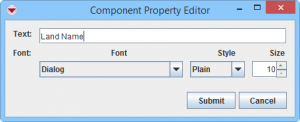
|
|||
| Country Structure | 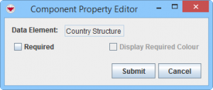
|
|||
| Date | 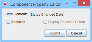
|
|||
| Icon/Image Tool | |
Add an Image to the Data Entry Form Template | ||
| ID widget | 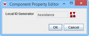
|
Apply a Local ID Generator | ||
| Line Tool | 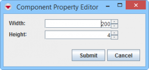
|
Add a Line to the Data Entry Form Template | ||
| Multiple Select | 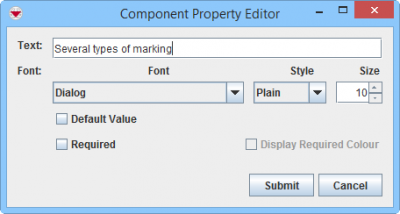
|
Add values to enumeration list | ||
| Number / Text Field | 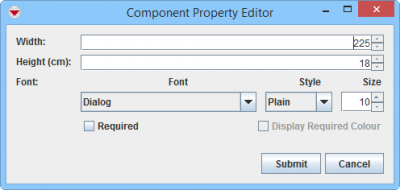
|
|||
| Organisation | 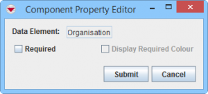
|
|||
| Place | 
|
|||
| Single Select | 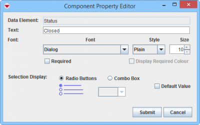
|
Add values to enumeration list Change Single Selection Option List | ||
| Text Area | 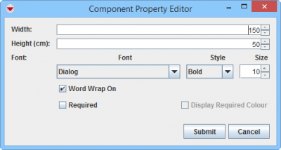
|
| ||
| Table | 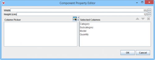
|
Change table properties |
| |||||||||||||||||||||||||