Difference between revisions of "Change Element Display Properties"
| (8 intermediate revisions by 2 users not shown) | |||
| Line 5: | Line 5: | ||
Fields are added to the form template design pane with default properties such as width and height. You can modify these properties to customise the look of your data entry form template. | Fields are added to the form template design pane with default properties such as width and height. You can modify these properties to customise the look of your data entry form template. | ||
| − | + | ||
<ol> | <ol> | ||
| − | <li> | + | <li>To open the Component Property Editor either |
*Double-click the field that you would like to change. | *Double-click the field that you would like to change. | ||
*Select the field and click the '''Properties''' button. </li> | *Select the field and click the '''Properties''' button. </li> | ||
| − | + | The fields in the Component Property Editor window differ depending on the widget type selected. | |
{| class="wikitable" | {| class="wikitable" | ||
| Line 27: | Line 27: | ||
| | | | ||
|- | |- | ||
| − | | Icon Tool | + | | Icon/Image Tool |
| [[Image:Icon tool property editor.png|300px|]] | | [[Image:Icon tool property editor.png|300px|]] | ||
| [[Add an Image to the Data Entry Form Template]] | | [[Add an Image to the Data Entry Form Template]] | ||
| Line 41: | Line 41: | ||
| Multiple Select | | Multiple Select | ||
| [[Image:MS property editor.png|400px|]] | | [[Image:MS property editor.png|400px|]] | ||
| − | | [[Add | + | | [[Add values to enumeration list]] |
|- | |- | ||
| Number / Text Field | | Number / Text Field | ||
| Line 57: | Line 57: | ||
| Single Select | | Single Select | ||
| [[Image:SS property editor.png|400px|]] | | [[Image:SS property editor.png|400px|]] | ||
| − | | [[Add | + | | [[Add values to enumeration list]]<br /> |
| − | [[Change Single | + | [[Change Single Selection Option List]] <br /> |
| − | [[ | + | [[Change Display Option for Single Select]] |
|- | |- | ||
| Text Area | | Text Area | ||
| [[Image:Textarea property editor.png|400px|]] | | [[Image:Textarea property editor.png|400px|]] | ||
| {{New_6.0 | In version 6.0 the display choice between Text Field and Text Area for Text field CDFs has been introduced.}} | | {{New_6.0 | In version 6.0 the display choice between Text Field and Text Area for Text field CDFs has been introduced.}} | ||
| + | [[Image:Word wrap.png|321px|left]]<br/><br/> | ||
| + | If the scroll bar is still visible after you have changed the CDF to Text Field '''OR'''<br/> | ||
| + | you have removed the Word wrap for a system field then drag in the field again.<br/> | ||
| + | Minimum field height for text size 12 is 21.<br/> | ||
|- | |- | ||
| Table | | Table | ||
| Line 75: | Line 79: | ||
{{NavBox HowTo Data Entry Forms}} | {{NavBox HowTo Data Entry Forms}} | ||
| − | [[Category: | + | [[Category:NAA]] |
Latest revision as of 19:38, 7 July 2021
| How To |
|---|
Fields are added to the form template design pane with default properties such as width and height. You can modify these properties to customise the look of your data entry form template.
- To open the Component Property Editor either
- Double-click the field that you would like to change.
- Select the field and click the Properties button.
The fields in the Component Property Editor window differ depending on the widget type selected.
| Element | Property Editor | Read More | ||
|---|---|---|---|---|
| Label / Text Tool | 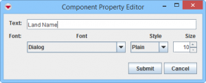
|
|||
| Country Structure | 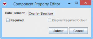
|
|||
| Date | 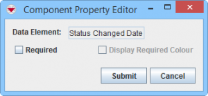
|
|||
| Icon/Image Tool | |
Add an Image to the Data Entry Form Template | ||
| ID widget | 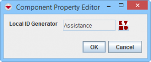
|
Apply a Local ID Generator | ||
| Line Tool | 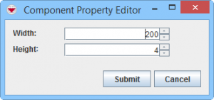
|
Add a Line to the Data Entry Form Template | ||
| Multiple Select | 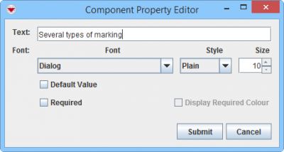
|
Add values to enumeration list | ||
| Number / Text Field | 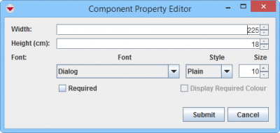
|
|||
| Organisation | 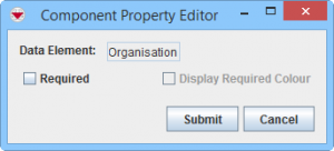
|
|||
| Place | 
|
|||
| Single Select | 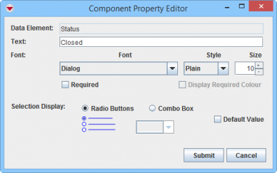
|
Add values to enumeration list Change Single Selection Option List | ||
| Text Area | 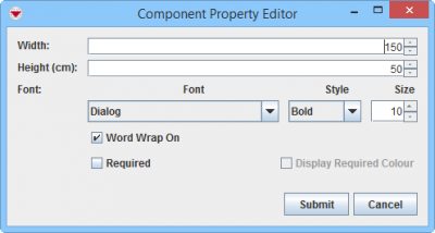
|
If the scroll bar is still visible after you have changed the CDF to Text Field OR | ||
| Table | 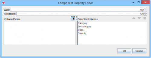
|
Change table properties |
| |||||||||||||||||||||||||